Don't put all your eggs in one basket! Proverbial as it is, this piece of wisdom suggests that one has recognized the possibility of mitigating risks by means of diversification long before Markowitz gave it a key role in investment portfolio construction. Fine, but is it easy to genuinely diversify a portfolio in today’s capital markets? Markowitz has indeed highlighted that it is not the mere number of asset classes or securities in a portfolio that provides diversification, but the fact that those assets should at least and on average not all move in the same direction at the same time. The present investigation will show that genuine diversification has become harder to achieve in the wake of the Great Financial Crisis as quantitative easing (QE) has become the “new normal”. By triggering a fresh, global and pronounced round of QE, the Covid-19 crisis has struck another heavy blow to diversification.
To provide diversification, the components of a portfolio should at least not be positively correlated. To provide diversification, the components of a portfolio should at least not be positively correlated. Preferably, like the shares of high street retailers and online distributors, they should ideally even move in opposite directions, because what is good for one component – like a recession and deflation for fixed-income securities - should be bad for the other – like equities. In short, efficient diversification requires negatively correlated assets.
One simple way of measuring patterns in the co-movements of asset prices is to create a portfolio in which selected representative asset classes are equally-weighted. In our investigation:
• The five equity market indices of interest are the MSCI indices USA, Europe ex-UK, UK, Japan and EMs.
• The five bond market indices of interest are the FTSE US Government 7-10 year, the ICE BofA Euro government 7-10 year, the JPM EMBI+ total return index, the ICE BofA US cash pay high yield and the Bloomberg Barclays Asset-Backed securities USD.
• The S&P GSCI commodity spot price represents commodities.
• The twelfth asset class of interest is gold.
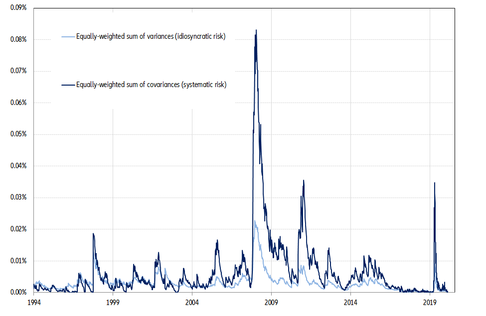
All returns are total returns measured in USD. The variance of this equally-weighted portfolio is the sum of two terms:
• The sum of the respective variances of the 12 component asset classes, which measures the idiosyncratic risk of our equally-weighted portfolio.
• The sum of the 66 covariances between the 12 asset classes, which measures the systematic risk.
Figure 1 – Idiosyncratic and systematic risks of an equally-weighted portfolio
To provide diversification, the components of a portfolio should at least not be positively correlated. To provide diversification, the components of a portfolio should at least not be positively correlated. Preferably, like the shares of high street retailers and online distributors, they should ideally even move in opposite directions, because what is good for one component – like a recession and deflation for fixed-income securities - should be bad for the other – like equities. In short, efficient diversification requires negatively correlated assets.
One simple way of measuring patterns in the co-movements of asset prices is to create a portfolio in which selected representative asset classes are equally-weighted. In our investigation:
• The five equity market indices of interest are the MSCI indices USA, Europe ex-UK, UK, Japan and EMs.
• The five bond market indices of interest are the FTSE US Government 7-10 year, the ICE BofA Euro government 7-10 year, the JPM EMBI+ total return index, the ICE BofA US cash pay high yield and the Bloomberg Barclays Asset-Backed securities USD.
• The S&P GSCI commodity spot price represents commodities.
• The twelfth asset class of interest is gold.
All returns are total returns measured in USD. The variance of this equally-weighted portfolio is the sum of two terms:
• The sum of the respective variances of the 12 component asset classes, which measures the idiosyncratic risk of our equally-weighted portfolio.
• The sum of the 66 covariances between the 12 asset classes, which measures the systematic risk.
Figure 1 – Idiosyncratic and systematic risks of an equally-weighted portfolio